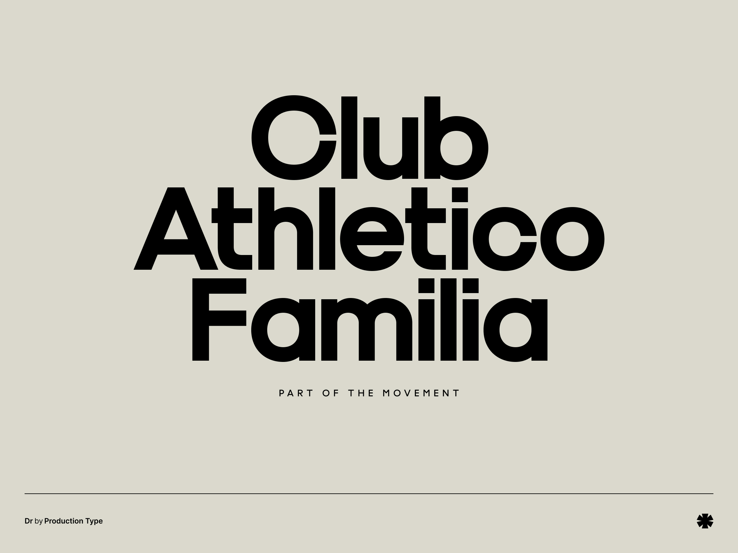
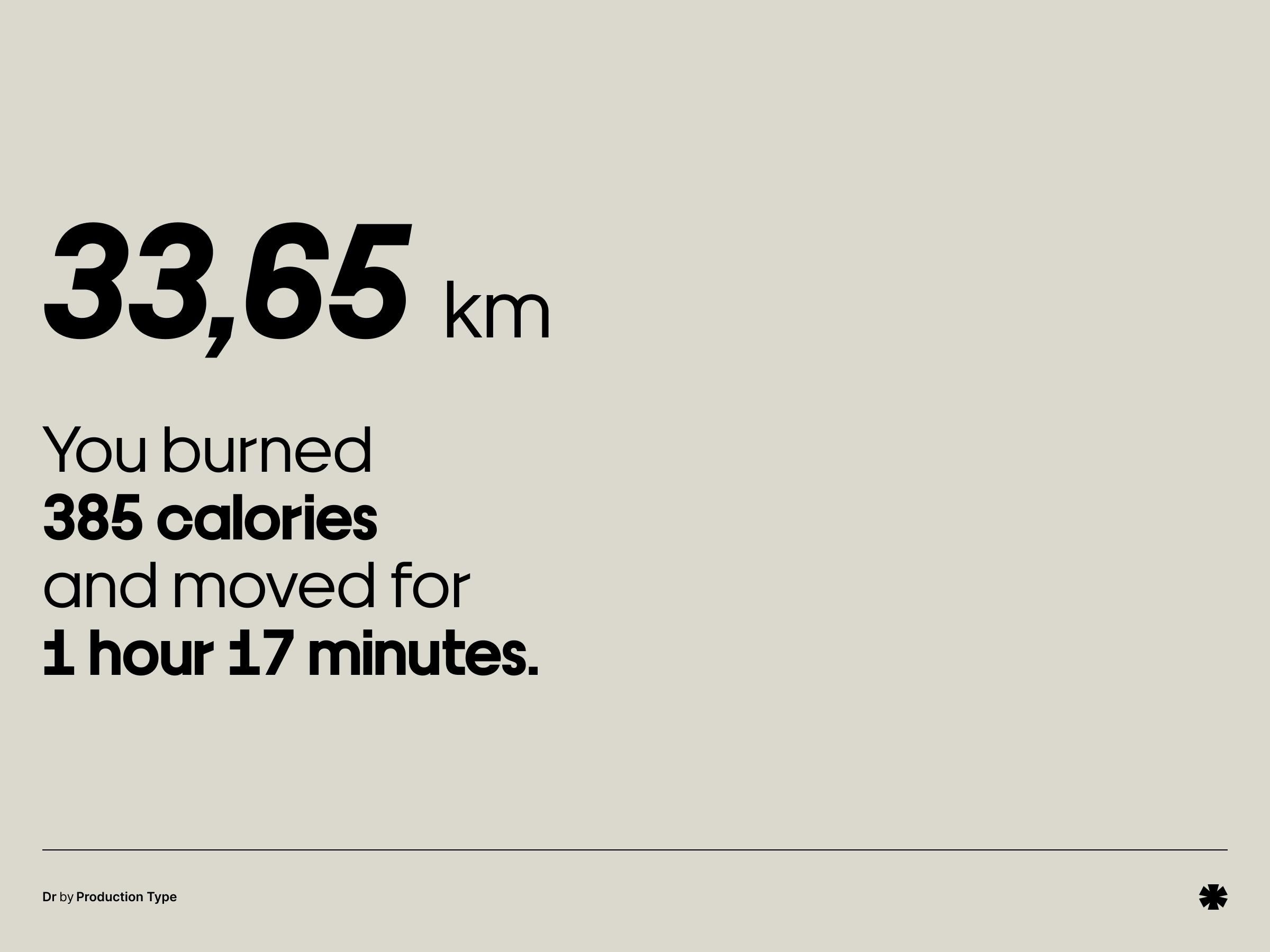
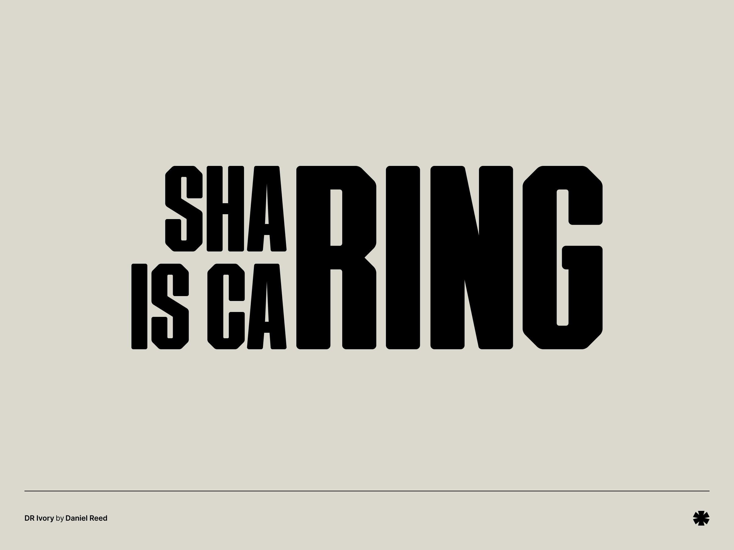
Dr is a geometric sans serif family that is quirky, bold, and looks almost limbic, with varying proportions and parts of the letter body assembled as if they were parts of a human body. This, of course, is derived from the history of the typeface, originally designed for a company specializing in prosthetics.
category
foundry
Production Type
designer
Bureau Brut / Quentin Schmerber
release year
2017
pricing
paid


you might also like
 Florentine
 Rom
Rom Base Neue
 Orelo
Orelo